My favorite amateur radio event of the year, by far, is Field Day. Each year ARRL issues a new Field Day logo. Let’s take a look at logos of years past.
First, let’s get the mediocre ones out of the way.
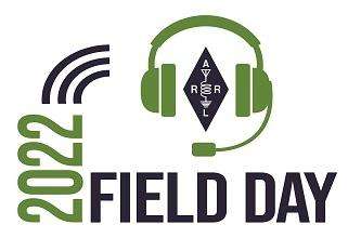
The 1980’s called. They want their logo back.The 2006 logo was meh. Get ready for more radio waves.The 2019 logo wasn’t awful, but it was rather unremarkable and low effort. At least replace the yellow with something else. Is that a target or radio waves?I think the 2015 logo was made with Microsoft Word on someone’s lunch break, another low effort logo. Hey, where’s the ARRL diamond/antenna circuit logo? This is the only logo in the bunch where the ARRL diamond took a hiatus. All you’re getting this year is some radio waves.The 2018 logo had me scratching my head. The design is actually good in my opinion and took some work, but what is up with Grid Chase and #hashtag #hashtag? This one just feels really contrived and like a commercial or a promotion of some program.I’m sorry, but the 2022 logo, well, it’s blah. It feels stiff and uncompelling. Why is the ARRL logo wearing headphones? I think an engineer attempted to be a graphic artist. No, just, no.
Now let’s look at some good logos.
2007 and 2013 had cute cartoon logos. Not bad.
2005 and 2014 were yagi antenna years.
I actually like the stylized yagi in the 2014 logo, and On the Air from Anywhere is a rather clever. But what is up with the yellow?
Radio waves are a common theme, as seen in the 2006, 2015, 2019, 2010, and 2022 logos. In 2008 we had Ride the Waves, but with a sine wave representation. (Hey, why are there two of us transmitting on the same frequency?) This logo is nice. It is visually appealing, free-flowing, yet more sophisticated than a lot of the logos. But ditch the yellow. Please.
The 2021 logo isn’t too shabby, though I feel it could have used some refinement. This is the only logo in the group depicting modulation. Looks like AM to me.I can tell a lot of effort went into the 2011 logo. It’s the only logo of this style, and is quite different from other years. I get the feeling I’m in Arizona or New Mexico. Yellow is OK here. We’re in the desert. Hey, why aren’t we on top of that mountain? Man, it’s hot out here. I need a cold drink.
2016 and 2017 had monochrome style designs. I like both of these as they have a simple, yet cool feeling. 2017 was another yagi year, though we got stacked yagis as a bonus. Are those more radio waves, and emanating from a boot? In any case, I give FD16 an A+ for the outdoorsy color choice and the hiking boot footprint. Well done.
2009 is hands-down my favorite logo, however, I won’t declare it the best logo. Hang tight. This logo has it all. I adore the forest green color. I love the font choice (the same logo was used in 2005). We have a person and their dog. (Who doesn’t love a friendly dog?) You have evergreens, and an old school wall tent for camping. You got a yagi and a dipole. Is that the sun or the moon? Don’t know, don’t care. This logo illustrates the perfect FD setup for me.
2012, in my opinion, is another great logo, though I may be biased due to its theme being similar to the 2009 logo. Note that the 2014 logo has a similar yagi. I like this stylized depiction of a FD site. Good job.
And now for the best logo, evar…
The 2020 logo is like no other. It’s cool, it’s hip. (Perhaps even chill ?) Someone at HQ thought out of the box and nailed it. You got an old VW bus, ARRL logo stealthily yet stylishly placed on the front of the vehicle (and not plastered clumsily on the side like other year’s logos), whip on the side. Business in the front, party in the back. As if that wasn’t enough, we got your radio waves and a groovy font. Can we get more of this in coming years?
This article was originally posted on Radio Artisan.
Anthony, K3NG, is a regular contributor to AmateurRadio.com.
4 Responses to “A History and Critique of Field Day Logos”
Hi Mike. 2009 is my favorite. I didn’t want to be presumptuous and declare my favorite as the best from a design perspective, but if more folks fee the same, we can declare 2009 the winner 🙂
Each individual posting is the property of its respective author and the opinions expressed may not represent those of AmateurRadio.com including its editor, staff, or sponsors. Content may not be reproduced without written permission.

 A History and Critique of Field Day Logos


 HamRadioAuctions
 Reliance Antennas
 Enigma Shop
 R&L Electronics
 antennas.us
 QRV
QRV
Mostly agree, but believe the 2009 is the hands down best.
Hi Mike. 2009 is my favorite. I didn’t want to be presumptuous and declare my favorite as the best from a design perspective, but if more folks fee the same, we can declare 2009 the winner 🙂
1000% agree with the 2020 logo. Best yet!
I definitely agree 2009 is the best. I’m curious what’s wrong with yellow?